Lots of buzz over Brian Cox using the latest GISS land and ocean graph to put down Malcom Roberts in a TV debate in Australia. Likely we will be seeing the image everywhere and alarmists crowing about “deniers” dismissed once and for all. For the record here is the graph showing no pause whatsoever:

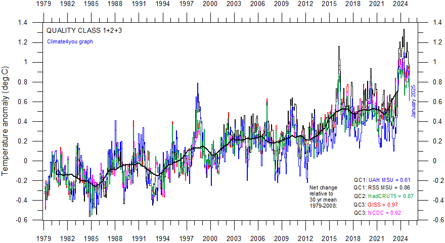
This is accomplished by lowering the 1998 El Nino spike relative to 2015 El Nino. To see what is going on, here is a helpful chart from Dr. Ole Humlum at Climate4you

It shows that indeed, GISS is showing 1998 peak lower than several years since, especially 2002, 2010 and 2016. In contrast, the satellite record is dominated by 1998, and may still be in that position once La Nina takes hold later this year. The differences arise because satellites measure air temperature in the lower troposphere, while GISS combines records from land stations with sea surface…
View original post 388 more words