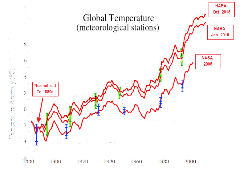
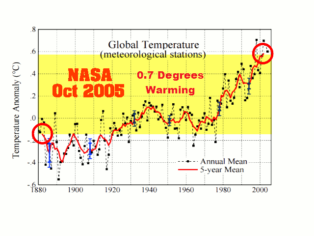
I’m trying out some new ways to help people visualize how NASA data tampering has nearly doubled 1883-2003 warming since 2005, and how they made the hiatus disappear in 2015.
The next graph shows only the five year means at the same scale, but normalized the three graphs to the 1880s. Note how they have adjusted the data nearly an order of magnitude out of their own error bars. A smoking gun of incompetence and fraud by the criminals who are behind the biggest scam in history.