And read the comment by Tim Ball regarding his interaction with Hubert Lamb.
We’ve covered this topic before, but it is always good to mention in again. Howard Goodall asks this on Twitter:
“Ever wondered why climate scientists use anomalies instead of temperatures? 100 years of catastrophic warming in central England has the answer.”
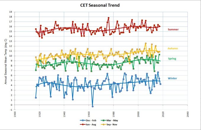
He provides a link to the Central England Temperature data at the Met Office and a plot made from that data, which just happens to be in absolute degrees C as opposed to the usual anomaly plot:
Now compare that to the anomaly based plot for the same data from the Met Office:
The CET anomaly data is here, format example here.
Goodall has a point, that without using anomalies and magnified scales, it would be difficult to detect “climate change”.
For example, annual global mean NASA GISS temperature data displayed as an anomaly plot:
Source: https://data.giss.nasa.gov/gistemp/graphs/
Data: https://data.giss.nasa.gov/gistemp/tabledata_v3/GLB.Ts+dSST.txt
Now here is the same data, through…
View original post 516 more words


