By Paul Homewood
h/t Kelvin Vaughan

https://www.metoffice.gov.uk/climate/uk/summaries/actualmonthly
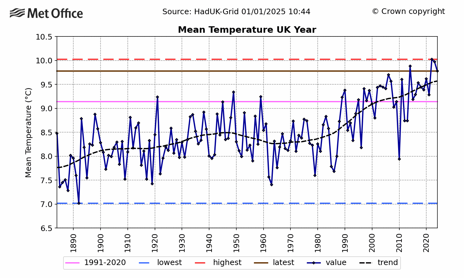
We are all doubtless familiar with the Met Office’s UK temperature chart, showing a clear rise during the 1990s and early 2000s, but one that has levelled off since.
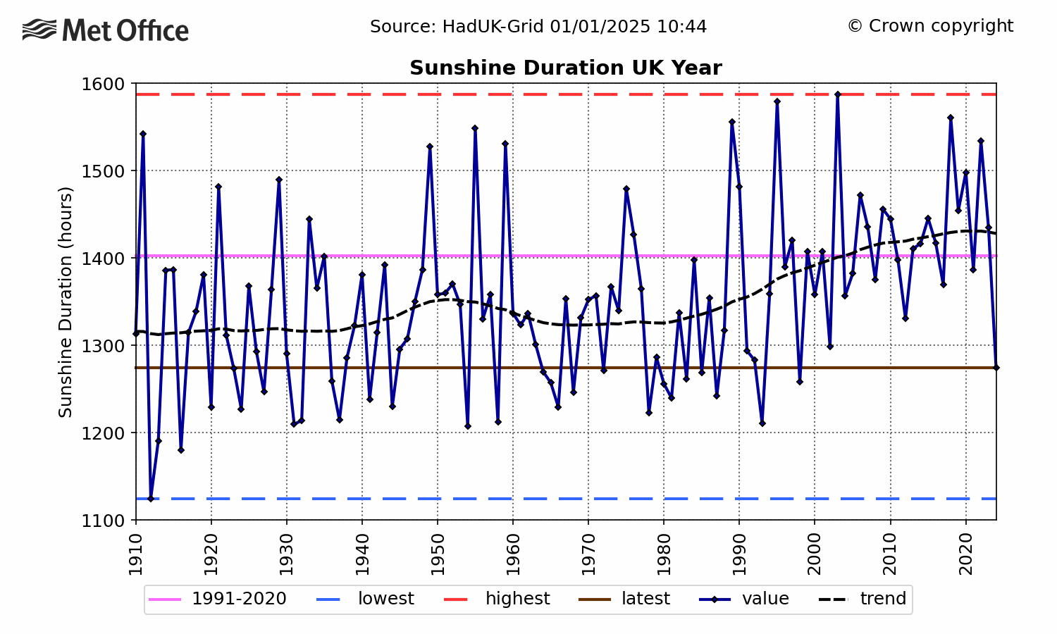
You may be less aware, however, of a very similar increase in sunshine hours, which began at around the same time, and which has also since levelled off.

Coincidence? Maybe.
View original post 155 more words