Reblogged from Musings from the Chiefio:
I’ve mentioned a few times that the loss of thermometers after the “Baseline” period seemed to preferentially lose those in High Cold Places. Well, thought I, I think I can now graph that… So I did.
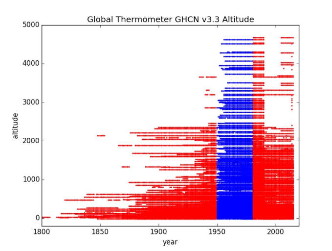
One thing I noticed was that the graphs strongly reflected the Hadley choice of baseline, extending to 1990. I thought of doing them all over again, but kind of like the way there’s a distinct slice of “Hadley Special” next to the blue NASA GIS baseline… (You’ll see what I mean).
Initially this was a challenge to do as there were some “limits on number or records that can be graphed being blown” and I was getting error branches without explanation. Adding “DISTINCT” to the stn_elev fixed that (and gave me what I really wanted anyway:
Is there a station at that altitude, or not?
IF 2 or more stations share exactly the same altitude, they will only show up as one dot, but that ought to be rare.
I also ran into some stations at -1000 meters elevation or so. WH? Turns out they are “missing data” flagged at -999 m (I’ll put a table at the end listing them).
First up will be a purple graph of All Stations. I start this in 1800 instead of 1850 (actual data goes back into the 1700s but it’s useless as there’s almost no thermometers). This lets you see the ramp up to “usable numbers” in 1850+ a bit better. I mostly left the altitude / years limits the same so the graphs can be directly compared, but Alldata, Asia, South America, and North America needed 5000 M limits (the rest are 4000 meters).
Change of Altitude over Years
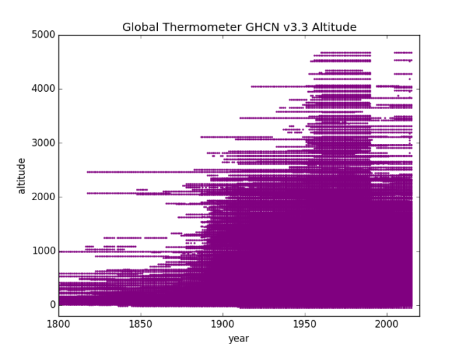
Nice Big Fat lump of stations at altitudes above 2000 Meters in the baseline period. GIS temp starts in 1950 to 1980, Hadley runs 1960 to 1990. It looks like about 1950 to 1990 is at high altitude, the better to accommodate both I guess. Then the altitudes start to thin and things run off to the beaches and lower elevations.
Given the recent discussions of how temperature is a function of pressure / altitude:
“I think this matters”…
I’m now going to do the Regions (continents). Again, minus Region 8: as first off there’s no data outside the baseline and second off, no altitude data in those records (sea level being presumed?) or missing data flags of -999 m.
Region 1 – Africa

Africa is a lot shorter than I’d expected. Nothing over 2500 meters. I don’t see any obvious special treatment of the Baseline for altitude. Perhaps the changes in Africa are more “by latitude” (since we saw that in the area graph…)
Region 2 – Asia
In this one you can very clearly see the Hadley Basline where those stations at altitude have a ‘red tag’ on the side extending from the GIStemp baseline end of 1980 out to the Hadley baseline end of 1990. Then Oh Boy do they prune those mountains out of the data! Everything over about 1750 M getting thinned and stuff over about 2250 M getting massacred.
Region 3 – South America

This one is a little different. We don’t lose so many very high altitude, mostly losing stations in that 1200 M to 2200 M band, BUT, look at the additions down low in the 200 M to 1000 M band. Loading up with lower altitude ought to be as effective as reducing high altitude. Then, those 1-2kM stations will be “infilled” with hypotheticals from down in the more tropical and coastal areas. Nice trick!
Region 4 – North America
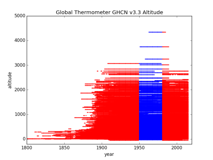
This was one where the volume of data was causing me grief. It still has the bottom of the graph very solidly colored. This likely needs breaking out by sub-regions to get a better visualization of the loss. It is still clear that “At Altitude” gets dropped just after the Baseline period, though they were nice enough to hold those top ones into the Hadley baseline (that red tag on the side of the blue).
Region 5 – Australia / Pacific

Still a couple of stations at altitude (maybe in New Zealand?) but the rest pretty much toast. Huge bite out of the 750 m to 1250 m range. That sounds like Australian mountains to me.
Region 6 – Europe

A very distinct offset in the European data to the “Kept In The Baseline” being aligned with Hadley 1960-1990. Just after that the “High Cold Places” get heavily thinned.
Region 7 – Antarctica

Well, at least they kept one high altitude station. Probably a big name one so deleting it would cause notice…
In Conclusion
Here’s the report of stations where there is a -999 missing data flag:
mysql> SELECT name, stn_elev, stationID FROM invent3 WHERE stn_elev
You would think, what with Google and all, they could look up the altitudes, but “whatever”. I note that 4 Antarctic stations made the list.
Here’s one example of the program. I didn’t save every copy this time as they differ only in the setting of the Region number:
# -*- coding: utf-8 -*-
import datetime
import pandas as pd
import numpy as np
import matplotlib.pylab as plt
import math
import MySQLdb

plt.title("Global Thermometer GHCN v3.3 Altitude")
plt.xlabel("year")
plt.ylabel("altitude")
plt.ylim(-200,5000)
plt.xlim(1800,2020)

try:
    db=MySQLdb.connect("localhost","root","OpenUp!",'temps')
    cursor=db.cursor()

    sql="SELECT DISTINCT I.stn_elev, T.year
    FROM invent3 AS I INNER JOIN temps3 as T
    ON I.stationID=T.stationID WHERE I.stn_elev>-100"

    cursor.execute(sql)
    stn=cursor.fetchall()
    data = np.array(list(stn))
    xs = data.transpose()[0]   # or xs = data.T[0] or  xs = data[:,0]
    ys = data.transpose()[1]

    plt.scatter(ys,xs,s=2,color='purple',alpha=1)

    plt.show()

    plt.title("Global Thermometer GHCN v3.3 Altitude")
    plt.xlabel("year")
    plt.ylabel("altitude")
    plt.ylim(-200,4000)
    plt.xlim(1800,2020)

    sql="SELECT DISTINCT I.stn_elev, T.year
    FROM invent3 AS I INNER JOIN temps3 as T
    ON I.stationID=T.stationID WHERE T.region='3'
    AND I.stn_elev>-100 AND  year>1949
    AND year<1981 AND I.stationID NOT IN
    (SELECT I.stationID FROM invent3 AS I
    INNER JOIN temps3 AS T ON I.stationID=T.stationID
    WHERE year=2015);"

    cursor.execute(sql)
    stn=cursor.fetchall()
    data = np.array(list(stn))
    xs = data.transpose()[0]   # or xs = data.T[0] or  xs = data[:,0]
    ys = data.transpose()[1]

    plt.scatter(ys,xs,s=2,color='blue')
#    plt.show()

    sql="SELECT DISTINCT I.stn_elev, T.year
    FROM invent3 AS I INNER JOIN temps3 AS T
    ON I.stationID=T.stationID WHERE T.region='3'
    AND I.stn_elev>-100 AND (year>1980 OR year<1950);"

    cursor.execute(sql)
    stn=cursor.fetchall()
    data = np.array(list(stn))
    xs = data.transpose()[0]   # or xs = data.T[0] or  xs = data[:,0]
    ys = data.transpose()[1]

    plt.scatter(ys,xs,s=2,color='red',alpha=1)

    plt.show()

except:
    print "This is the exception branch"

finally:
    print "All Done"
    if db:
        db.close()
After the first run I commented out the purple graph as I didn’t need to keep making it 😉
I’m pretty sure this code is right, but it was a bit tricky to get past various odd errors, so I might have missed a trick in the disruption.
