The Climates of Europe
Europe ranges from the frozen to the deserts of the Middle East. Most of the countries are geographically small, but terrain can vary dramatically in short distances. Just look at the change from Switzerland to the Mediterranean coast of northern Italy. I’ll try to take things in a reasonable order that allows for better comparing one set of graphs to a nearby country. For much of Europe, water dominates, as there are coastlines on the Atlantic, North Sea, Norwegian Sea / Arctic, Black Sea, Baltic Sea, Mediterranean, etc. etc. For other bits, mountains and inland conditions dominate. But being compact, the larger external drivers tend to be the same over many neighboring countries and their graphs ought to be comparable. Ireland and the UK, or the Baltic States for example.
Here’s the Koopen Climate map from the wiki:
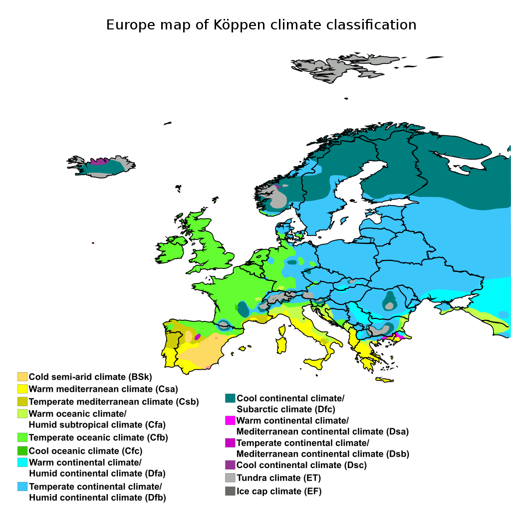
Euope Koppen Climaate Map
You will need to look at the Middle East for some of the countries included in “Europe” from the GHCN point of view, so here’s that climate map:
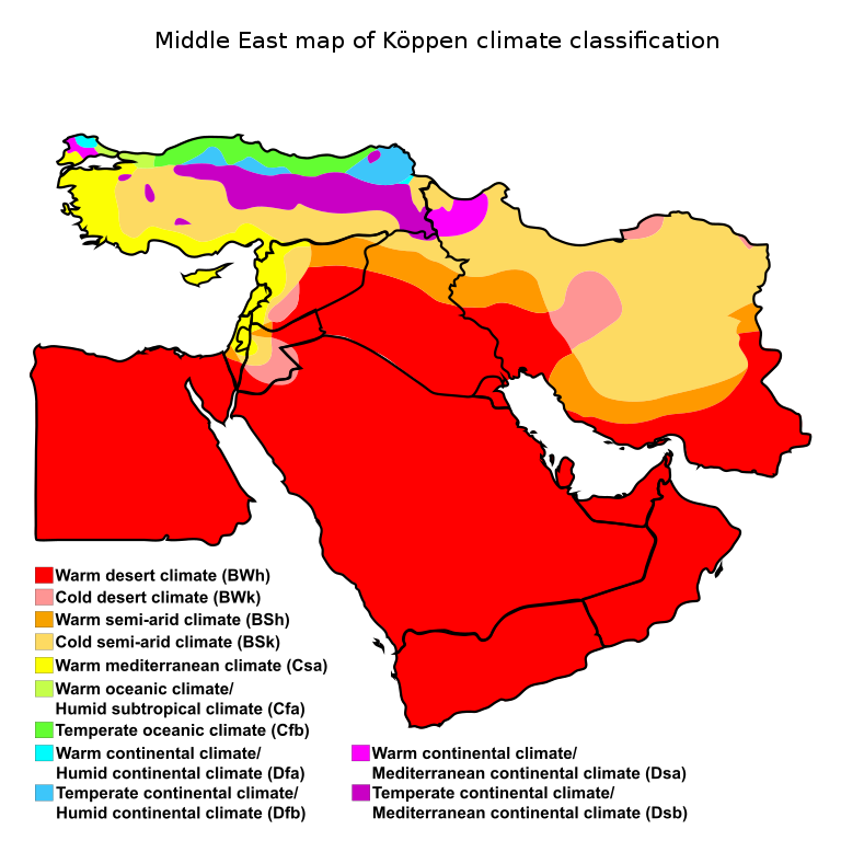
Middle East Koppen Climate Map
As GHCN v3.3 divided Russia and Kazakhstan into a European part and an Asian part, but v4 does not, I’ve moved the European part of the data into Asia for the comparison graphs, so those countries are in the Asian graph posting. For our purposes, Europe stops at the Russian Border, not the Urals.
I’ve done a general grouping of countries into bands that more or less follow the map of climate zones. I was not rigorous about it. So some countries might be more properly compared to a different set of nearby countries. Let the map be your guide for your own comparisons.
In general, I start with the Middle East / bit of Mediterranean band, then work along the Mediterranean to the Atlantic coastal countries, and back across the more inland nations, finally turning to those with coastlines on the Baltic Sea and Arctic Ocean. Moving from hotter to colder with the volatile inland areas in the middle.
So to some extent my groupings were just to make the process more orderly rather than strict climate matches. But it ought to put comparable places next to similar neighbors most of the time.
I’ve made a quick first comment on each of these countries. Of neccesity, given the number, these are at best a cursory look and some sniditude sprinkled in. This group desperately needs some “Crowd Sourced” scrutiny of the graphs. I’ve flagged a couple that are particularly dodgy, and noted The Usual “drop the baseline 1/2 C raise the present about 1/2 C” and the frequent “The Jump” about 1990-2000 (that likely correlates with MMTS rollouts, IMHO… but needs a good “Dig Here!” for each country).
One other theme is the frequent 1C to 2.5 C range of “change to history”. IF our v3.3 data were really that crappy in 2015, what evidence proves it is any less crappy now? How do you find 1/2 C of “Global Warming” from CO2 inside 2 C of “random error” and maybe another 1 C of “thermometer changed; moved near buildings for the wire”?
It just looks to me like the data are crap and being “massaged”, with each release, to fit a narrative. That’s my opinion; I hope you will look at the graphs and form your own.
With that, here’s Europe:
The Countries
Here are the countries of Europe per GHCN. You will note many of the abbreviations do not match the names. That is due to the names changing over time, different native language spelling, etc. Also note that R! and K!, the European parts of Russia and Kazakhstan in GHCN v3.3 are not graphed here, so we subtract 2 from the 57 total lines to get 55 “countries” for graphing:
MariaDB [temps]> source bin/Europe.sql
+------+-------+--------+----------------------------+
| cnum | abrev | region | cname                      |
+------+-------+--------+----------------------------+
| 601  | AL    | 6      | Albania                    |
| 602  | AM    | 6      | Armenia                    |
| 603  | AU    | 6      | Austria                    |
| 604  | AJ    | 6      | Azerbaijan                 |
| 605  | BO    | 6      | Belarus                    |
| 606  | BE    | 6      | Belgium                    |
| 607  | BK    | 6      | Bosnia and Herzegovina     |
| 608  | BU    | 6      | Bulgaria                   |
| 609  | HR    | 6      | Croatia                    |
| 610  | CY    | 6      | Cyprus                     |
| 611  | EZ    | 6      | Czech Republic             |
| 612  | DA    | 6      | Denmark                    |
| 613  | EN    | 6      | Estonia                    |
| 614  | FI    | 6      | Finland                    |
| 615  | FR    | 6      | France                     |
| 616  | GG    | 6      | Georgia                    |
| 617  | GM    | 6      | Germany                    |
| 653  | GI    | 6      | Gibraltar [United Kingdom] |
| 618  | GR    | 6      | Greece                     |
| 699  | GK    | 6      | Guernsey                   |
| 619  | HU    | 6      | Hungary                    |
| 620  | IC    | 6      | Iceland                    |
| 621  | EI    | 6      | Ireland                    |
| 698  | IM    | 6      | Isle of Man                |
| 622  | IS    | 6      | Israel                     |
| 623  | IT    | 6      | Italy                      |
| 697  | JN    | 6      | Jan Mayen [Norway]         |
| 693  | JE    | 6      | Jersey                     |
| 624  | JO    | 6      | Jordan                     |
| 625  | K!    | 6      | Kazakhstan E               |
| 626  | LG    | 6      | Latvia                     |
| 627  | LE    | 6      | Lebanon                    |
| 696  | LS    | 6      | Liechtenstein              |
| 628  | LH    | 6      | Lithuania                  |
| 629  | LU    | 6      | Luxembourg                 |
| 648  | MK    | 6      | Macedonia                  |
| 630  | MT    | 6      | Malta                      |
| 631  | MD    | 6      | Moldova                    |
| 632  | MJ    | 6      | Montenegro                 |
| 695  | MH    | 6      | Montserrat                 |
| 633  | NL    | 6      | Netherlands                |
| 634  | NO    | 6      | Norway                     |
| 635  | PL    | 6      | Poland                     |
| 636  | PO    | 6      | Portugal                   |
| 637  | RO    | 6      | Romania                    |
| 638  | R!    | 6      | Russia E                   |
| 639  | RI    | 6      | Serbia                     |
| 641  | LO    | 6      | Slovakia                   |
| 642  | SI    | 6      | Slovenia                   |
| 643  | SP    | 6      | Spain                      |
| 694  | SV    | 6      | Svalbard [Norway]          |
| 645  | SW    | 6      | Sweden                     |
| 646  | SZ    | 6      | Switzerland                |
| 647  | SY    | 6      | Syria                      |
| 649  | TU    | 6      | Turkey                     |
| 650  | UP    | 6      | Ukraine                    |
| 651  | UK    | 6      | United Kingdom             |
+------+-------+--------+----------------------------+
57 rows in set (0.01 sec)
55 is a LOT of countries and that’s 110 graphs. That’s one long posting. Due to that, I’m going to divide Europe into several parts. Middle East near the Mediterranean and including bits in the Cacasus, then across the Mediterranean coastal areas, at France & Spain we transition to countries that are also Atlantic Coastal, pick up Portugal, the UK, and others before heading back inland across the inland countries. Finally making the turn up the Baltics and into the Nordic countries.
This may not end up an equal number of nations in each grouping, but it will tend to group together those nations with similar environments.
Middle East & Black Sea:

IS Israel
JO Jordan
LE Lebanon
SY Syria
CY Cyprus
TU Turkey
AM Armenia
AJ Azerbaijan
GG Georgia

Mediterranean:

GR Greece
MK Macedonia
AL Albania
MJ Montenegro
BK Bosnia and Herzegovina
HR Croatia
SI Slovenia
IT Italy
MT Malta
SP Spain
GI Gibraltar
PO Portugal

Atlantic:

EI Ireland
IM Isle of Mann
GK Guernsey
JE Jersey
UK United Kingdom
FR France
NL Netherlands
BE Belgium
LU Luxembourg

MH Montserrat

Inland:

GM Germany
PL Poland
EZ Czech Republic
LO Slovakia
AU Austria
LS Liechtenstein
SZ Switzerland
HU Hungary
RI Serbia
BU Bulgaria
RO Romania
MD Moldova
UP Ukraine
BO Belarus

Nordic & Baltic:

LH Lithuania
LG Latvia
EN Estonia
FI Finland
SW Sweden
DA Denmark
NO Norway
JN Jan Mayen [Norway]
SV Svalbard [Norway]
IC Iceland
Should you need to look up where one of these countries is located, here is the Political Map of Europe (click or open in a new tab to embiggen):
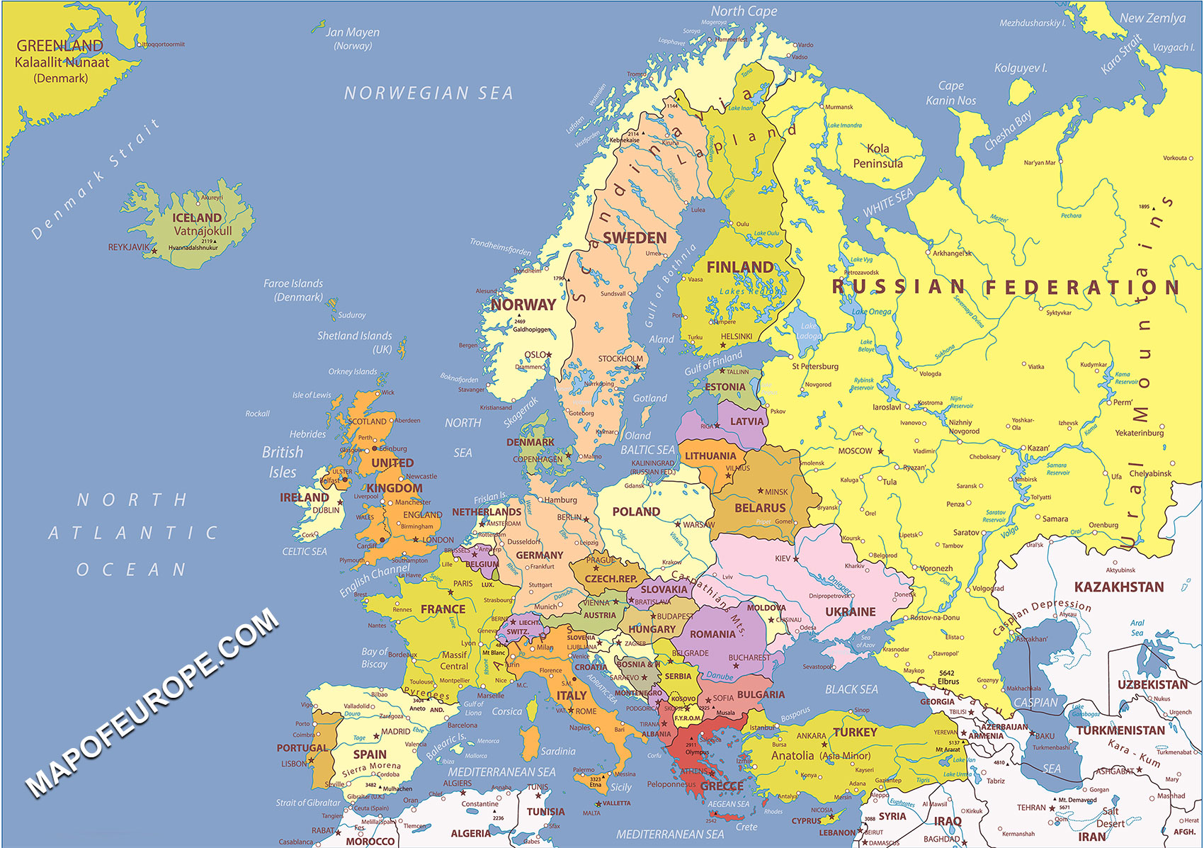
Political Map of Europe from mapofeurope.com
Do note that the political map of Europe is subject to rapid and unexpected changes and has been in such rapid flux since at least the Greeks and Persians “arguments” and well before the Roman Empire rearranged the whole thing (not to mention the Holy Roman Empire). Then there were the W.W.I and W.W.II changes, and most recently Russia trimming a bit off Ukraine. Just realize the data often dates from times when the country was a different country, different size, shape, and sometimes location. (Poland got shifted over about 300 km, at the end of W.W.II.) How these specific geographical changes are accounted for in the data is a minor “Dig Here!”. Just don’t expect this political map to be precise in 20 years. Or perhaps even next week… /snark;
The Graphs
For most countries there are two graphs. The second one typically shows the v3.3 “anomaly” average for a given country with one dot for each year of data, and the v4 anomaly average for the same country for the same years. You might expect them to mostly be the same, after all, it isn’t like we can go back to 1800s Spain and install some more thermometers. Yet they are typically different. This seems very odd to me as this is the “Un-adjusted” data set.
The GHCN documentation goes out of their way to state that the upstream national Bureau Of Meteorology might well do their own adjusting, but the changes seen across so many countries are so similar that some systematic changes must be happening after collection of the data. Is this a “Quality control” process? Is it mining historical records to collect missing data points? Is it just using more thermometers so “instrument change” artifacts show up? Is it a deliberate “Data Diddle”? Is it “homogenization” that is not being called an “adjustment”? Does it matter what is the cause?
The first graph in each set is just the difference between the v3.3 and v4 anomaly dots on the second graph. This makes it much easier to see the changes and any patterns in them. What you might expect to see would be a mostly straight line at zero as most historical data ought not change, Perhaps one or two years where a spot is off zero as some data were filled in, or an instrument was found to have errors in the reporting that were correctable (Say during an overlap of two instruments during an upgrade, and which instrument was used in the average was changed). You would especially expect that THE most recent data from our best and newest instruments would be most stable. That isn’t what you will actually see. Often, the most recent data changes the most. Odd that.
A note on the “Baseline Period”: NASA GISS uses 1950-1980 as a “baseline” for computing anomalies. Hadley uses 1960-1990. The creators of GHCN load up the data set with extra records for more instruments during that “Baseline Period” spanning about 1950 to 1990. It is my opinion that this biases the data. One simple example (that we saw in the Africa graphs) is that the more instruments you have, in more places, the harder it is to have an extreme event in the data. You might have a cold hail dump in a very small area, or an opening in cloud cover causing a warm spike, and get a couple of C of movement. But over a larger area, those small scale events tend to be averaged out. For this reason the early years of data often have a much wider range of the “anomaly” as there is only one instrument. As more records are made from more instruments, this range narrows. Now, what is truly odd, is that after the Baseline Period there is a large reduction in the number of instrument records used; yet the range continues to narrow for most countries. Something else is going on with the recent data.
To avoid those “Baseline Artifacts”, I compute these anomalies without a baseline. How? For each instrument record, for each month of the years, I add up all the data points and find the average. The instrument record is only compared with itself, and only within each individual month. Each monthly data point is then differenced with the average for that month for that instrument record to find the anomaly for that data point. For example, if the Rome Airport record in June is averaged and found to be (a hypothetical) 31 C and June of 1948 was found to be 32.4 C then the anomaly would be +1.4 C. Then all the anomalies for a given year inside a given country are averaged to make the ‘spot” on the anomaly graphs below.
In this way no “baseline” is needed. June in Rome has an average monthly temperature and it ought to be representative across all years. IF this June is warmer than the average of all past Junes, then it is a warm June. Where this “has issues” is that it will change the average as more data is added in a given instrument record. If, for example, the most recent years of v4 are all hotter, then the v4 average will be slightly hotter and then the “anomaly” of older data will be lower as the difference from a hotter average will be greater. Since v3.3 was in use through 2015, there are only 3 years additional data in v4 (out of a set that spans over 200 years) so this effect ought to be small. Should one wish to eliminate it entirely, the v4 data could be truncated in 2016. As my goal is to find and illuminate sources of change, not average them away and hide them, I prefer to emphasize what is happening in the data and make visible what otherwise might be hidden in the more traditional processes. Do note that even using a “baseline period”, in the example given, the present data would show as abnormally warm and the general distribution of the anomaly plots would be substantially the same
Part of my goal is to illuminate how just using “anomalies” does NOT fix issues of instrument change. The assertion is made that instrument changes do not matter as the data are used as anomalies. Well, here I’m using anomalies and instrument change DOES matter. It is my belief that it matters when using a baseline period as well (just harder to demonstrate).
So keep in mind that these graphs are for the purpose of discovering issues while the usual processing is for the purpose of removing issues (or covering them up). Different purposes require different approaches.
With that, we’ll start our “European” tour in the Middle East, and over toward countries of the Caucasus.
Middle East & Black Sea:
IS Israel
I’m going to describe some of the things we see in the graphs in more detail here. Later I’ll refer to them in a more shorthand way. So reading this description and a bit of study of this set of graphs is helpful for all the other comments.
Over 2 C range in the changes, the non-adjustment adjustments between v3.3 and v4. Here we see the (by now) classic pattern of cooling the past with most of the time before about 1940 dropped by 1/4 to 1/3 C, some as much as -1 C. Then the transition to warming the data at about 1980. Finally, in the 2000’s, we see something more like fine tuning. Raise a little here, take a tuck there, and you get a nice trend at the end out of otherwise more scattered data.

Looking at the anomaly plot we see a few, by now classic, features. There’s a big “Dip” in the “baseline period” from 1950 to 1990 with very few hot years and a much narrower range of the data. The very first years range more broadly (likely due to just one instrument in the record). A line laid across at about the +1C level intersects similar anomalies in the pre-1940 period as in the post 2010 period. Part of what makes this interesting is that in the recent data for most of the GHCN there are far fewer thermometer records than in earlier years, so is the “hot now” just an artifact of returning to fewer instruments? A similar line at about -1C has most of the data riding just on top of it between about 1880 and 1990, with scattered outlier years 1/2 C to 1 C below it. Then “something happens”. Suddenly all the “low going anomaly” years never get below zero. Between 1900 and 1990, the range of the volatility of years is about 2 C (from +1c to -1C) yet after 2000 it is closer to 1 C or even less than that. Did yearly weather volatility really end? Or is some processing done to the data removing cold excursions? Were instruments in places prone to cold excursions dropped from the record?
We see that in the data for California. All four of the current stations in GHCN v3 were “on the beach”. One in San Francisco, 3 down near Los Angeles. It just is not possible to have a very cold excursion there. Gone are the data from the high cold snowy Sierra Nevada, the inland northern areas that freeze hard in a Canada Express. I suspect this happens around the world too, but have not mined the data to find out (yet). So an open “Dig Here!” is to find out just why the Israel data suddenly stops having any cold years. After all, we’ve recently had abnormal snow in the Middle East with “once in a lifetime” snowfall in some areas. You would expect that to show up as a cold year “anomaly”, yet it doesn’t. Why?
Looking at the red spots vs black we find them much colder in the deep past, typically moved above the black spots more recently. Then there is what looks like the reduction of range in v4 vs v3.3; where some spots further from the mass of the data get pulled closer. That’s a bit harder to just “eyeball” and so is an object for future statistical analysis. Is some “QA Process” being used to compress the accepted range of data?
Finally, I note one other thing I’ve seen a few times. THE most recent red dot is not far from zero. Hmmm… how can it be constantly accumulating heat when so many of the countries of the world are, right now, just about average? Yet the past got colder… Also, it is often the case that the data from the prior decade or two gets changed a LOT but the most recent year or two doesn’t. It is as though there is an attempt to reduce the “SCREAMING HOT!!!” claims of the mid-2000s so that the present data points looks hottest. We see some of that here with some of the post-2000 data points pulled down to below the +1 C line.
Overall, it just looks very “un-physical” the way the baseline period drops, then post-baseline has very narrow range and a huge “flip” upward (often narrowing to a point – I’ve taken to calling that a “Duck Tail” as it reminds me of one. Israel has a recent near zero data point that kind of mutes the effect, but it’s still visible). What would be expected is that the range of prior years ought to be preserved in the present, and the whole mass of data ought to “turn upward” if there were “Global Warming”. Essentially the parallelogram of data ought to be preserved, but bend. Instead we see a reshaping of the data from a 2 C wide “band” into a 1/2 C wide flip / spike; then the present data point stuck on the end. It just looks very very wrong and “manicured”.
Now, just for a moment, scroll down one country and look at the anomaly plot for Jordan. These two countries are almost on top of each other. At one point Israel is only about 10 miles wide, IIRC. They share a border at the Jordan River. You would expect their two anomaly graphs to be almost identical (perhaps with a bit more range for Jordan as it is a little more inland). Yet they are quite different. How does coastal Israel warm almost 2 C out of the “baseline period” while more inland Jordan only manages 1 C? Whatever is causing the changes is at odds with known geology, physics, and weather patterns. In general, comparing neighbor countries leads me to believe that it is instrument issues and siting issues “shaping the data” more than anything to do with CO2.
Why did CO2, constantly accumulating and with much more impact in the first bit of accumulation than in the latest (it has a decreasing effect from more additions as it has already done what it will do…), why did it “wait” from the onset of significant production in the 1930s all the way to about 1995 before having any effect in the Israeli data? Why is it that ONLY after the year 2000 does CO2 suddenly suppress cold years? IMHO, the answer is that “it doesn’t”. Something else is “shaping the data” and it isn’t CO2.

What happened about 1990 to 2000 across all the various countries? There are a couple of highly likely suspects, IMHO. We generally converted from “Liquid in glass” thermometers to electronic MMTS instruments. These use electrical power and have a wire connecting them to a building. This means they often had to be closer to buildings than in the past. Concrete and tarmac are known to suppress cold anomalies as they soak up heat during the day and give it back at night. Furthermore, there is a strong bias toward using airport data (shown in the earlier v2 analysis) and airports changed from grass fields to minor asphalt runways to 10000 feet of wide concrete at Jet Ports over the years. Furthermore, we’ve had massive airport expansion with hectares of tarmac and concrete poured out for parking areas, taxiways, and more. Then, burning tons of kerosene per hour tends to keep the local air a bit warmer… As does removing all the snow for winter operations. That kind of thing matches the appearance of the data far better than does a decreasing effect with onset in about 1950 from accumulating CO2.
OK, this was the “deep dive” on reading a set of graphs. From here on out it will be much shorter notes. You know what to look for now and how to look for it, so I’m just going to toss in things that strike my fancy.
JO Jordan
Over a 2 C range of “changes”. Generally everything prior to 1985 cools, with the notable exception that the 1950s data go a bit nuts. Recent “best quality” data with 3/4 C range to the diddle factor.

Compared to Israel, Jordan looks a lot less “manicured”. Hardly any “Duck Tail” at all. Range of data stays around 2 C anomaly until after 2000. We again have the odd bit that the last dot is “near zero” and just prior data got changed.
Overall, not really seeing “warming” in Jordan.

LE Lebanon
Oh God is this one a mess. over 2 C range to the “changes”? Really? On this we base paranoid delusions about a 1/2 C of “Global Warming”?
At least the data cut off in 2000 for the comparison. (We get to just “eyeball” the v4 data in the second graph). Pretty much a mess, though, with a bit of overall warming of the deep past but between 1900 and 1980 a whole lot of “cooling the past”.

It is quite possible that the recent anomaly data goes “off scale” of this graph. Generally, when data points plotted very near the upper bounds I’d replot with wider bounds and find more spots. This was enough of a mess I didn’t see the value.
We get “the usual” dip in the baseline then post about 1995 a sudden Jump Up of about 2 C, yet recent data points are nearer the zero anomaly line. So despite all that, no “Global Warming” in Lebanon, eh? So what happened to the data between 1990 and 2010? CO2 doesn’t act for only 2 decades, then stop.

SY Syria
Pretty much bombed to rubble now, so recent data not good for much. How much did history change?
Some minor cooling of the past in the baseline period of about 1/4 C, a strange “dip” around 2000, then things go crazy with 2.5 C range of changes.

A very sparse plot. Looks like v4 added some historical data pre-1950. We get “the usual” dip in the baseline period though more centered on 1970 – 1990. Present temperatures about zero anomaly. Lines at +1C and -1C pretty much bound the mass of the data with similar outliers over the line (modulo the drop-out in the baseline)… until 2000 when low going data are gone. We see this a lot.

CY Cyprus
Island, surrounded by warm water. Ought not change much.
BUT, we get over 2 C range of changes of the past. Scattered all over the place. Then, post the dropout around 1990, all the data are warmed about 1/2 C.

Looking at the anomaly plot, it is pretty much bounded by a line at +0.75C and -1C until 2000. Then the lower bound shifts up to about the zero line and we get some hot anomalies in the +1.75 range. What causes a “step function” like that? Instrument change does. CO2 not so much…

TU Turkey
Turkey had complained that GHCN was only using the few thermometers that showed warming and ignoring the ones that showed cooling. Wonder if that “sensitized” folks to not fool with Turkey? Looks like some W.W.I data got adjusted.
This is more nearly what you would expect the difference graphs to look like. Almost all the data points at or near zero. A couple of places where some historical issue might have been found, and fixed (and that ought to be annotated in footnotes… but isn’t). I do find it odd that we’ve got an over 1 C change in the most recent data, though only one year.

The anomaly plot is more like I’d expect to see also. Range “about the same” over most of the graph. Lines about +1.25 C and -1.25 C contain most of the data points with similar “outlier” years over time. The only really odd bit is the way, again, cold excursions end in 2000 and we get a kind of short fat “duck tail” (maybe more like a goat tail 😉

AM Armenia
This kind of difference graph just shouts “data quality or data diddle” issues. You have a rather stochastic 1/2 C of change spread pretty much over all years. What on earth justifies that? Is it an artifact of adding in / changing what thermometers were in use? If so, how can we claim 1/2 C of “Global Warming” when it could just be instrument changes that are ignored (and happen in ALL the data)?

Not much to see here, really. A bit of general cooling of the past, but mostly just note that the range of “normal” is wider at about +1.75C and -2C. Recent data not outside that range significantly. Only really “odd bit” is (again) the loss of cold anomalies after 2000.

AJ Azerbaijan
Odd changes here. There’s a flat zero lead-in segment (what I’d expect to see in a lot more countries) then all the anomalies drop by 1/4C to 1/2 C. Mostly I’d suspect they added another instrument record in Azerbaijan and that induced some jitter in the yearly averages. At least, that’s the “Dig Here!” I’d look for first.

Interesting shape to this anomaly plot. It looks like the “embarassing” pre-1880 data with a warm bit were dropped. A line at -1C has cold anomalies below it pretty much across the board. After 2000, there’s still a couple, but the space above the line has fewer between it and the zero line; so still some strong “thinning” of the cold anomalies going on. IF you include that 1875 data, a line at the +1 point shows not much changing at all until the post-2000 era when you get a few years jumping up by 2C to almost 3C of anomaly. Yet others at almost -3C anomaly. This graph likely ought to be redone with 4 / -4 range to assure there’s nothing further out.

GG Georgia
How does it work that the most recent ‘best ever’ data has the most variation and change in the “unadjusted” data?

A line at +1C / -1C contains a pretty much rectangular mass of data with modest excursions, up until the post 2000 era. Then it pops up to +2C to +3C. Nothing below +1C. Wonder if they had an airport renovation? It certainly isn’t CO2 gradually accumulating over 1/2 century.

Mediterranean:
We now move to the Mediterranean coastline. You might argue with some of my choices about Atlantic vs Mediterranean, for places like France that are a bit of both. But the grouping of the graphs doesn’t prevent you scrolling down to look at and compare whatever you like. I’ve tried to group things that I think can be easily compared, closer to each other.
These places ought to be strongly water moderated and with very flat temperature anomaly plots. Their temperatures ought to track somewhat the local water temperatures. Cyprus, up above, could be compared here, too.
GR Greece
Interesting difference graph. before 1900 has a bit of a dip, after that a similar size rise until the 1950 start of the baseline period when it starts to dance around by about 1/2 C all over the place.

Not much “Global Warming” visible in the anomalies for Greece. the range of 1.5 C in the early years narrows a bit by 1900 likely as more thermometers show up. It stays about between the +/-1 C lines until 1960 when we “take a dip” of about 1 C for the baseline tops, then post 2000 we get ‘the usual” loss of stuff below the -1/2 C anomaly point The most recent data point being below zero, “Global Warming Has Left the Parthenon!”… 😉 There’s a couple of high stragglers in the prior years of the 20-teens but not dramatically higher than the 1C normal range line and similar to the 1920’s data
Way to go Greece! Singlehandedly conquering “Global Warming”!

MK Macedonia
Similar ‘near zero’ line of no changes in the deeper past, then 1/2 C of “jitter” in the “recent” data (up to about 1990). Wonder why v3.3 cut off in 1990?

Ah, that explains it. It was cooling then…
So is that 1900s data to be believed? BOTH v3.3 and v4 keep it in, so I’d say so. It is nicely warmer than now…
A line at +1 C “takes a dip” in the 1970-1990 part of the baseline period, but both the 1930s and the recent period are about the same. No “Global Warming” here, either. Again, the latest data point is below zero, so cool in Macedonia. We do see a “thinning out” of low going anomalies after 2000, and if you removed the latest data point you would have a nice Duck Tail, but the only warming is statistical via averaging away the present cold data point into several just prior warm ones (just call it ‘weather’ and ignore it), and using the “dip” in the baseline period as, well, your baseline…
Compared in total, there is no warming. Just a cold dip in the “new little ice age” ’70s.

AL Albania
In some ways not interesting. In others interesting in that this is how it ought to look (minus the hole of missing data…) with a very flat run of almost nothing changing up to 1980. Then there’s a little “tuck” in the baseline period of about 1/2 C but only for 1/2 decade of it. The big gap of 20 years is bit odd, though.

So v4 adds some data prior to 1950 and puts some “in the gap”. OK. A line at about -0.8 C looks to connect the bottoms, with the most recent data right down there in the “We’re COLD not warming” end of things. A line at about +1 C connects the “new” data from 1940s with the data from about 2009 as both ride just on top of it.
Overall, it looks to me like, at best, there’s a cycle with peaks in 1945 and 2010 (so about a 65 year span) and at worst theres some data doctoring going on in the baseline period to make a bit of dip so ‘the present’ looks warm in comparison.

MJ Montenegro
Oh Gawd! Cool the past by 1/2 C, then after the 1990 end of the baseline period, go nuts with 3.5 C range of “changes”? How can you possibly use that to say anything about Climate? From one “version” of “the same data” to another a 3.5 C range of random changes?

The anomaly plot shows the expected “dip” in the baseline period but otherwise a line at +/- 1C bounds the bulk of the anomalies. Recent “data” have both high and low “fliers” in the 1-2 range and -1 to -2 range. Double the number above than below, so statistically it will average to “warmer”, but it isn’t. It’s just more wild and random changes in the data.

BK Bosnia and Herzegovina
Now that’s the way to sculpt data! Drop the past by a full 1 C, and fairly consistently too! Then warm the present by up to 1 C, but with some random variation so it doesn’t look too suspicious.

And just look at the result! A marvelous tilted set of temperatures rising from -2 C anomaly to +2 C anomaly. Just beautiful!
But, uh, fellas, you do know that CO2 is only supposed to have caused 1/2 C of warming so far, right? That other 3.5 C of warming is kind of an embarrassment…

HR Croatia
This is what I’d expect to see from added instruments in one set vs the other. Sort of a ‘snake in a tunnel’ effect with semi-random wandering between bounds in about a 1/2 C range. Then we hit the ‘baseline period’ of 1950 and that range just compresses right out as more instrument records are loaded up in that range.

The expected “dip” in the baseline, but otherwise a line at +1C nicely catches most of the tops… until 1995. Similarly, a line at -1C catches most of the bottoms, though there’s a strong dip in 1940 but it looks like that is slowly being erased.
Then, just after 1995 we get a very strong turn upward in the whole mass of the data. I note that the 2000-2010 data for v3.3 look to have been cooled down so more recent data can look ‘hottest evah!”. So sculpting that v4 data into a more finely pointed Duck Tail.
Then, no cold recent data point for these folks, no sirree. A good solid +1.5 C hot anomaly for them. Ignore those other countries nearby with a very cold “now”…
Somehow I don’t think CO2 would have hung around making things cooler through 1990 and then suddenly make it warmer by 1C almost overnight…

SI Slovenia
Another difference graph that’s a real mess. From -1 C cooling in the early 1960s to +1.75 warming added in the 1990s? Just what the heck is going on with this “historical” data?

Then that shape we’ve gotten far too familiar with. Nearly nothing changing until the 1990s or so. Small dip centered on 1975 in the baseline period. Then “WHACK!” it’s suddenly 2 C hotter and no low going anomalies below zero after about 2010.
So the assertion is that CO2 causes a +2 C change, in one decade. NOTHING before that. Right? Bueller? Bueller?…

IT Italy
WOW. Deep past changes by at least +2 C (and may have gone off my graph range), then they cool most of the past by about another 1/2 C, then run up the recent data by 1/2 C. Looks like Italy is with the program of Data Diddle.

Well, I can see why they needed that much “change of historical record”. Just look at those hot 1800s black spots. Those just had to go! (Nobody cares about the 1700s so you can ignore them. No, really. GIStemp cuts off the data in 1880 and Hadley in 1850 IIRC.) There’s a very severe “dip” in the baseline period then “the usual” flip up after 2000. Still, a line laid at +1C (use a ruler on your screen if you need to) has more spots above it in the past than recently. Any “warming” comes as a statistical artifact from the severe pruning of low going cold years after 2000. MMTS at airports anyone? Or just what ever caused that 1/2 C warming of the “historical record” in v3.3 to v4?

MT Malta
Little island. Middle of the water. Not a lot of places for changing of location. So no real surprise almost all the “differences” are a straight line at about zero. Does look like a bit of effort to erase the “hot 1930s” and then a lot of nice cold added to the baseline period. Starting in 1960, so these are European centric folks as it’s only the USA that starts the baseline in 1950…

You will note that I got bored about here and started playing with the color. Many of the graphs after this have BLUE for the v3.3 anomaly dots. It was reaching the point where seeing black vs red was getting blurry… Hey, I’ve done about 200 “countries” by now! I think the blue is a little easier to see, at least on my monitor.
So lay a line at about the +1 C point. 1860-75 warm, 1949 warm (good thing it was just outside the baseline, so it didn’t need cooling!) and about the same now. For the BLUE dots. Then the red gets cooled a tiny in the past, raised some in the very recent period, and those bothersome “very hot years” from the late 90s-2000 push for $$$ get cooled down so as not to upstage the present.
We have a very fine plunge of over 1 C in the baseline period then a sharp pivot in 1980 with a straight line shot up by 2 C to now. Couldn’t do better with a chisle.
Then the very latest data point is left alone so nobody notices. Yeah, it’s at -1 C anomaly. It’s cold. You can fix it next year… Besides, in the averages nobody will see it. Just call it weather and move on.

SP Spain
OMG what a mess. 1.2 C colder deep past, baseline only 1/4 C colder. Recent data about 1/4 C of lift.
Guess it needed all that diddle to deal with those warm temperatures in the 1800s. It is essentially flat highs at about +0.8 C right up to 1990. Then the cold bound runs about -1 C past that cold dip of 1975 and THEN runs up after about 1990.
It really looks like a big bite was taken out of the highs in the “Baseline Period” and another out of the lows after 2000.

GI Gibraltar
Rock, stuck on the side of Spain. Lots of water. Some the more volatile Atlantic.
What can you do with all that stability and water…. I know, change the data!
So the past gets about a solid 3/10 C of cooling, then recent data get a good 0.5 C of warming. +0.8 C overall change of slope just from the changes of the data between v3.3 and v4. As there can’t be that many official recording stations on The Rock, so change of actual locations recorded is limited, one wonders what did change?
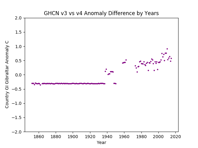
But desperate times call for desperate measures. Clearly with that mountain of hot in 1875 something had to be done to warm up the trend. So the past gets The Big Chill, and then post 1975 gets The Burn.
Oh, and once again I note that it is the loss of post baseline lows where all the “warming” happens, not in actually higher highs.

PO Portugal
Yeah, technically more Atlantic (that starts just one more down) but I left it here as it shares the peninsula with Spain and Gibraltar.
Not much changing in sleepy Portugal. 1/4 C cooling of the deep past and the baseline period. Some quasi-random jitter likely from changing what thermometers are in the set.

Hot mostly bounded by about a 0.8 C line with a couple of ‘fliers’ recently. Latest data points maybe 1/4 C above average. Nice stable pleasant. Bit of a dip in the baseline period. The hot 1930s-40s of elsewhere shows up here as a small loss of lows. Looks like that one cold year about 1998 gets warmed up some. Then anything “below average” or below the zero line is just gone.
I’m still wondering how CO2 causes (or even just allows) that Big Dip in the baseline (when we were all driving Muscle Cars that got 10 MPG over here) and then causes a sudden onset 1C rise in the lows after the 1990s (when it became Politically Correct to be a Warmista…)

Atlantic:
There’s a whole bunch of islands around Ireland and the UK. These all ought to look almost the same. Same water. Same climate. Lots of water to dampen temperature swings.
EI Ireland
Not much in the way of changes. Odd that the “best more recent” data have the widest range of change.

Doesn’t look like much Global Warming to me. Lines at +/-1 C pretty much bound the data. Last v4 data point a full 1 C up, but is that weather or is it wishful thinking? Hard to say.
This one really calls out for two trend lines on the blue and the red to see if any diddle was applied. That’s something for later.

IM Isle of Mann
No data in v3.3 so all we get is the v4 data:
MariaDB [temps]> SELECT COUNT(deg_C) FROM anom3 WHERE abrev=’IM’;
+————–+
| COUNT(deg_C) |
+————–+
| 0 |
+————–+
1 row in set (0.09 sec)
You would never think this was in the same general area surrounded by water. Almost 3 C increase from 1965 to about 2015.
IMHO that says there’s something wrong with the thermometer in Isle of Man. I do note that just 4 years back from the end we have a data point at negative anomaly, so it isn’t like the place is definitely on the Global Warming Agenda. I’d suspect more a change to MMTS and an airport improvement project when the Jet Age arrived.

GK Guernsey
No data in v3.3 so all we get is the v4 data:
MariaDB [temps]> SELECT COUNT(deg_C) FROM anom3 WHERE abrev=’GK’;
+————–+
| COUNT(deg_C) |
+————–+
| 0 |
+————–+
1 row in set (0.03 sec)
Flat to 1990, then jumps up about 1 C across the board and goes flat again. Instrument or site change anyone?
That last +2 C data point is strange, especially after the 0 the prior year. Someone park a jet near the thermometer?

JE Jersey
No data in v3.3 so all we get is the v4 data:
MariaDB [temps]> SELECT COUNT(deg_C) FROM anom3 WHERE abrev=’JE’;
+————–+
| COUNT(deg_C) |
+————–+
| 0 |
+————–+
1 row in set (0.42 sec)
No very hot last data point here. In fact, it’s a flat zero.
Other than a pronounced “dip” in the baseline period, it’s pretty much dead flat with a low bound about -0.8 C and an upper bound around +0.8C anomaly. There is also a tendency for lows to be missing after 1990 and for a few more highs near the upper range around 2000; but is that real or is that data collection artifacts? When did Jersey get an MMTS “upgrade”?
Also, are not Guernsey, Jersey, and Isle of Man close enough to each other they ought to be nearly identical?

UK United Kingdom
With all the scrutiny put on them after the Climate-gate email scandals, I’m not surprised their difference graph is nearly dead flat.
They do work in about 1/4 C cooling of the baseline and then the recent data get more juice, but only in a couple of years.

Again lay your visual line at about 1 C. Only the last couple of years bounce much above it recently, and those are almost the same as the bounce above in the late 1700s. A line along about -1 C also bounds most of the lows. There are a few more fliers in the early years with fewer instruments in the record, and it being the Little ice Age. About 1900 it’s warmer in the cold years. Then the baseline period hits, and the New Little Ice Age scare. Lows again reach below -1 C anomaly. There’s a clear “bite” out of the highs then too. Then, post 2000 is a bit odd. Generally lows are suppressed. But there is that odd string of cold years just prior to the latest batch.
In any case, I don’t see any actual warming so much as I see some loss of really cold years. I’m OK with that. Really really OK.

France
Looks like the French are not fooling around with their data much. Substantially flat. I wonder if the dip around 2000 was removing some fudge ’cause someone got caught? Wonder what was in their news then…

Very interesting anomaly plot. Partly due to just the length of it and 1760s being warm. Then it’s quite colder in 1850 and there’s that chunk from about 1850 to 1990 where the tops are bounded at about +1/2 C anomaly, while the bottoms from about 1790 to 1990 run about -1/2 C with some jitter. There’s a modest “bite” out of the highs in the baseline period, then The Pivot happens about 1995. BIG loss of lows, a full 1 C Jump Up in highs. then it pauses. Sure looks like instrument change to me.
So no real wonder they had to cool the data from the late 1990s to make the trend more “trendy”.

NL Netherlands
What in the world are the Dutch doing?
2 C range of changes to history. BIG cooling of the 1850 to 1900 era, then the 1700s warmed by 1 C? Is that so the “average change” is nearer to zero ’cause nobody cares about the 1700s? The baseline gets a nice 1/2 C cool spike added, but recent data also gets a tiny bit of cooling. We’ll have to see if that makes a better “trend” for v4 recent data points…

And it does! How nice. just prune out those bothersome hot years that were so important for justifying the prior Big Scare! stories and the Paris and Copenhagen meetings. The work on the 1800s is going nicely too. Though with that much hot 1800s to remove, it looks like you still have some work to do.
My overall impression of the mass of data (both blue and red) is that there isn’t really much warming going on here. Lines at +1 C and -1.5 C pretty much have similar stuff inside them and similar fliers outside. Only post 2000 “goes weird” with the loss of low going anomalies. Even there it looks like they started to put back in a couple of them.

BE Belgium
How can somewhere this small get that much thermometer data fiddle?
2.5 C range to the fiddle. LOTS of cooling of data post 1925, but more in the baseline period than outside it.

The actual anomalies look a mess too. Generally bounded by +1 and -1.5 C but not as smoothly as others. Big 1 C Dip in the baseline period. Post 2000 pruning of low going anomalies. Really? Only one cold year post 2000? No snow in Copenhagen during the meeting? Or did that not cross the border to Belgium? Then there’s that 2.5 C Rocket Ride up in the later couple of years. (Though I note the just preceding years have been cooled down so they don’t get in the way of the narrative…)
Frankly, that’s not looking so much like a duck tail as it is like a different kind of erection… not that I think Belgium might be full of folks looking to screw the rest of us or anything… So just tell me how CO2 does nothing until 2000, then makes it 2.5 C hotter…

LU Luxembourg
Ah, the Classics. Cool the deep past 1/2 C, grade it gently into the present just post 1990 baseline end, leaving a nice flat +1/4 C into the present. Top with a +1/2 C Cherry at the end. Someone went to art class, didn’t they?

The result? Up to 1980, a wonderfully cold past. Only one year was over +1 C and it’s been pounded back down. Nice deep cold at -2 C in some years. Then, about 1990, a gentle Pivot into a ruler straight rise of the highs by a smooth +2C, lows tagging along, and while a bit pruned, there are just enough low going years to look real.
Too bad it doesn’t look at all like the countries right next to you in the same climate areas and with the same weather. Such artistry being ruined by the neighborhood.

MH Montserrat
No data in v3.3 so all we get is this v4 anomaly graph. I do have to wonder why an island in the New World is showing up as “Europe” in v4, but it is, so here’s the graph.
MariaDB [temps]> SELECT COUNT(deg_C) FROM anom3 WHERE abrev=’MH’;
+————–+
| COUNT(deg_C) |
+————–+
| 0 |
+————–+
1 row in set (0.10 sec)
Really does look like an error. How could they let this data into the set? It isn’t warming at all. 1940-41 was the hottest year. Good thing they cut it off at 1970…

Inland:
All of Europe has water not too far away, but these countries start having much more inland effects. More mountains and more opportunities for temperature extremes. Polar Express air flows less muted.
GM Germany
Nice “tuck” taken in 1950. Then recently a couple of years with a hot pop.

A line about +1C shows the present not much different from the late 1700s. There’s a bit-O-cold in the Little Ice Age and in the Baseline Period. Similarly, a line at about -1.75 C clips the lows with an obvious rise between 1900 and 1950. Almost a square cut lack of lows.
Right on cue, post about 1995, we get the Pivot and highs rise 1 C in a straight shot up the Duck Tail formation. There’s a significant lack of lows after 2000, with just a couple of years showing below zero anomaly
Chop off the last half dozen years, would you call that warming? I’d not. At best, narrowing the range of excursions and pruning out cold years. Then given the stories of snow lately, I’d not even count the last half dozen years of the “pause” as warming either.

PL Poland
Doesn’t look like much being diddled in Poland.

Given some of the data points close to the upper edge of the graph, I likely ought to do one of these with +4 / -4 range to assure no “fliers” are off the page. I think I did that, but frankly it’s all a bit fuzzy now… 😉
A line at +1C has a consistent few fliers above it up to about 2000. There’s some dip in the 1950s part of the Baseline Period. Similarly, a line laid at -2 C is pretty much a ‘lower bound with a few fliers” up until about 1960. So is that bit that’s below -1.5 C centered on 1950 just the “new Little Ice Age” stuff, or a “baseline artifact”? Is the data below -2 C from 1700s to about 1875 just the Little Ice Age? Or the result of wide range from just one or a few thermometers. Probably doesn’t matter…
The “BIG DEAL” is really just post 2000. That’s where the cold anomaly goes to rapidly rising culminating in a +1 C lower bound, and the upper range of anomaly shoots up to at least +2 C, forming a generally broad fat rising tail. Then those two hot years in v3.3 get their blue spots whacked down to sharpen it all up in a very nice, if still a bit broad, Duck Tail.

EZ Czech Republic
Given how little natural warming they have to work with, I guess it is no surprise such desperate measures would be used in the Czech data.
Deep -1/2 C cut in the deep past, don’t bother cooling the end of the Little Ice Age, pull it down again into 1900, then a wobbly run up to +1/2 C warming of the more recent data.

The result? A VERY nice and VERY sharp Duck Tail at the end. Removal of a lot of that annoying 1700s heat.
We are still left wondering how CO2 basically does nothing from 1880 to 1990, with the highs actually cooling over the period, with lows basically around -1 1/2 C, and then suddenly “turn on a dime” about the year 1995 and rocket up temperatures by 1.5 C on the tops, and 3 C on the bottoms?

LO Slovakia
That’s a bit of a mess. Cooling the deeper past by up to 1 C seems a bit much. Warming the last few data points 1/2 C seems unnecessary in that context. Then chopping at the hot 1940s data by a full -2C? Man that’s vicious..

But the result does look like warming. Very un-physical, but hey, it was a quick hatchet job anyway, right? And Slovakia is so small it will just blend in with the averages and nobody will notice…
Hot bothersome 1800s data removed. Fill in the war years but without any hot years. (Average and homogenize much? /sarc;) then nothing much at all happening until about 1985 / 1990 when the Mother Of All Duck Tails gets made. Smooth as can be, not a single flier in sight.
So has Slovakia really been having ever less range of their weather since 1975 with lows consistently rising EVERY SINGLE YEAR by a total of almost 4 C ? REALLY?

AU Austria
Another one for the Ham Handed Brigade. Suck the past down by a consistent 1/2 C, pivot through the baseline and then raise temps by a consistent 1/4 C. The result?

Yet Another almost Ram’s Horn like Duck Tail.
Past cooled nicely. Just a 1/2 C at a time and eventually that whole hot history of the early 1700s can be erased. We cool into about 1990 as the top anomalies drop from nearly +2 C to just +0.75 C. On the bottoms, a line about -1.25 C pretty much is the floor under most of the data, though there are dips in about 1860 and 1950s. There’s a strange volatility range squeeze about 1975 with range narrowed to just 1 C or so. Then The Pivot happens and with lows rising faster than highs, we get a very nice Duck Tail, though with a ruffled spot about 2000.
So my usual question here: How did CO2 “Do Nothing” until the year 2000, then suddenly take action?

LS Liechtenstein
No data in GHCN v3.3, so all we get is the v4 anomaly chart.
MariaDB [temps]> SELECT COUNT(deg_C) FROM anom3 WHERE abrev=’LS’;
+————–+
| COUNT(deg_C) |
+————–+
| 0 |
+————–+
1 row in set (0.32 sec)
Only starts in the late 1960s? Then runs up by a full 4 C range from the low in 1985 to the high in 2010? I don’t know what’s going on there, but CO2 it isn’t.
It looks like there was a “step change” about 1992 with the data being in two blocks, offset by 1 C between them.
Might be an easy test case for when their thermometer changed to MMTS…

SZ Switzerland
More Germanic precision here Neatly pull down the past by 1/2 C go flat about 1900, then some rise at the end, but not too much, and “cherry on top’ in the last bit of data.

The result? More of that bothersome hot past removed as the blue dots fall. After about 1990, the pivot into a great sharp Duck Tail.
Lay a line at +1 C and it nicely aligns with the blue dots up to about 1950. There’s bit of dip in the colder 1800s and again a bit dip in the Baseline Period (odd, though, that we didn’t have as much Ice Age weather in the 1960s New Little Ice Age Scare as we had in the real Little Ice Age) and even to about 1990 where it intersects the warming out of the baseline dip.
A line about -1.5 C runs through most of the low excursions up to about 1900. Then it rises to about -1 C. That holds to about 1990. Then it is Rocket Ride City as low anomalies rise 3 C from -1C to +2C and narrow to a fine point.
But has Switzerland really warmed by 2 C in warm years, 3 C in cold years, and lost ALL cold years? Just since 1990 / 2000?
If so, what would this have to do with CO2, since we’ve been in The Pause since 1998 and CO2 ought to have had the biggest effect between 1940 and 1990 (at least, that is what they were telling us in the 1990s…)

HU Hungary
Another of the classic form. Cooing the past by about 1/3 C, rising to gentle warming of the recent data.

Volatility of about 3 C in the older data, likely from limited numbers of thermometers. Narrows to about 2 C in the late 1800s. Holds there, taking a dip in the “baseline period”, then about 1990 / 1995, The Pivot and we again get a finely sculpted Duck Tail.
Am I the only one who finds that sudden rise of 2 C and narrowing of range to a point, just a bit over the top insanely not physical?

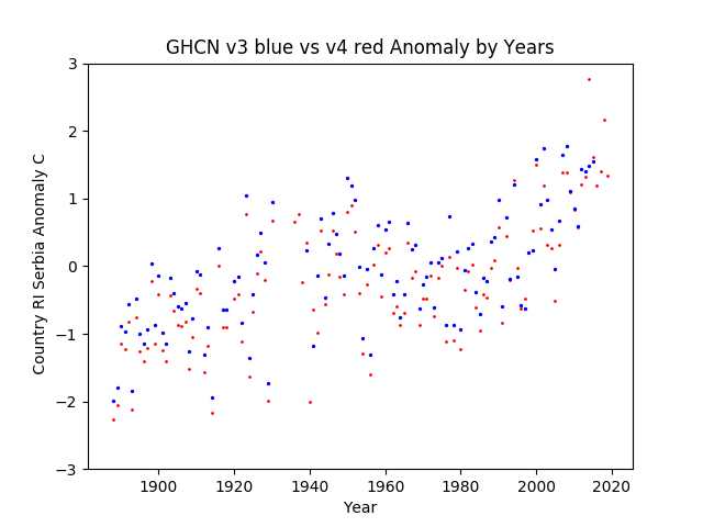
RI Serbia
Drop the past 1/4 C, shift to warming just a bit recently.

That’s an interesting shape. So it was -2 C in the late 1800s, rose to average about 1950. Stayed that way until 1995, then shoots up by a sudden 2-3C? Really? An overall rise of 5 C at the extremes?
BU Bulgaria
Quite a scatter in the 1940s and earlier. Bit of cooling all the way to recent, then a touch up.

OK, I can see why they needed to knock down the 1930s hot spot, then the baseline around the 1980s gets cooled too. Then had to take some out of the highs of The Pause so the most recent data looks warm. Got it.

RO Romania
Don’t know what to make of this. Sort of a sag in the middle with jitter effect.

Ah, I see. Making the baseline a bit lower, reducing the hot parts of the 1800s. Otherwise a line at 1 C would show nothing warmer really until the last data points and them only barely different from the 1800s highs. Then a line along about -1.25 C would also show not much happening (so those red dots needed a pull down) until about 2000 when low anomalies suddenly become extinct and lows rise by 2 C in under 2 decades. I also note that the highs near 2000 had to be banged down to sharpen the Duck Tail and make a better rise. Squash that Pause!

MD Moldova
Oh what fresh hell is this? 2.5 C range of “changes” to history? Really? Pull most of history down 1/4 C and then the “recent and best” data goes crazy with changes?

Ah, yes, the familiar. Squash the warm 1800s. Tilt the whole past lower, and especially pull down the higher blue spots in the Baseline Period, then bang down the Scare Hottest Ever of the early 2000s as we need more scare now, less Pause.
Then the oh too familiar by now, Pivot about 2000 where low going anomalies just go away. A full 4 C rise in the cold edge
A bit ham handed, but hey, who looks at Moldova?

UP Ukraine
General slight cooling of the past, The Dip into the baseline period gets some help, then things go nuts in the late 90s to date.

By now it’s becoming a bad joke how the Big Scare SIGN THE PARIS AGREEMENT SEND MONEY!!!! years of extra hot in the 90s and early 2000s have to be pounded back down so the recent data can be the Hottest Evah!!! But there’s no joke too old to tell again…
A line about 1 C (with the new pounded down data in the 90s / 00s) intersects the tops at the start and in about 1990. Bit of a drop out in the Baseline Period and about 1890.
A line about -1.5 C runs along with sporadic excursions below it until about 1995.
Then, The Pivot.
From 1995 or so to date, the highs rise about 1.25 C and the lows rise about 3.5 C forming a very sharp Duck tail (once you pound out the prior highs of the Big Scare For Paris era…)

BO Belarus
Well that’s different. A bit of cooling of the deep past, but from about 1950 onward it’s all a lot of cooling.

Oh, I see. Making those last data points really stand out has HOTTEST EEEEVVVVAAAHHHH!!!!! Guess you did have a lot of 1990s hot air to get rid of…
Strange how the bottoms stay cold until 2000, then run up at a crazy rate with a full +2C higher anomaly (from about -1C to about +1C.
So has Belarus enjoyed a giant surplus of grain production from this rise? I mean, compared to 1941, it looks like it is 5 C warmer. That’s just GOT to mean more grain production, longer growing seasons. Folks on the lake side beaches in swimming gear into the fall, shorter skirts, men in T shirts in spring working in the garden? It’s all like being in Crimea or Turkey now, right? Right? /sarc;

Nordic & Baltic:
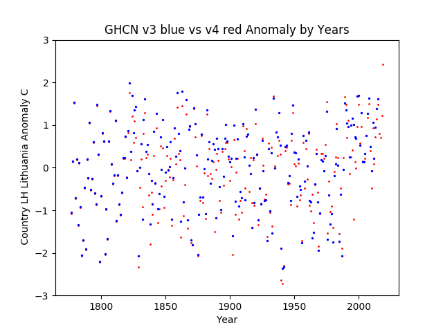
LH Lithuania
A bit of a puzzlement. We have “the usual” cooling of the past and added “dip” in the “baseline period”, but then the more recetent temperatures get cooled some as well. As though an algorithm did the first bits but someone was embarrassed about an inflated present and tried to fix it. That there is almost 2 C of “range of change” does not give confidence in a 1/2 C Global Warming signal hiding in that sea of changes.

Then, looking at the anomaly graph, it looks a lot like nothing much is happening. Other than the most recent “flyer” of a very high reading, the historical v3.3 highs are not increasing. That would explain the need to “cool the past”. Then we also have the common artifact of post 2000 the cold gets trimmed. Almost like the bottom half of the range is being left out. So is that deliberate Data Diddle, the effect of MMTS at concrete jungle Jet Ports, or does CO2 just wait 20 years then suddenly give you wonderfully pleasant days no warmer than before, but with no cold excursions everyone (including plants and animals) hates?
LG Latvia
About 1.5 C range of changes. A very gentle cooling of the past, then the baseline period gets a more vigorous cooling but with a lot of random jitter to try to hide it. Finally, the end gets a nice shot of warming in a couple of years, but overall cooling of the data.

Once again we see the latest data point left high (guess you do need to cool the “recent highs” so this year can look really high) and that “after 2000 kill the cold data” effect. The high range doesn’t really rise other than the last data point (but no worries, I’m sure it will be cooled off next time…)

EN Estonia
A 2 C range of “corrections” (or whatever these “non-adjustment adjustments” are), really? Again we get a deep cooling of the recent past, but leaving the most recent data point above it all as “Hottest Evah!” in the anomaly graph. The general cooling of the past by about 1/4 C continues too.

Looking mostly at the blue dots up through about 1995, there’s no warming at the top and no real loss of cold at the bottom. Then we had The Leap after 1995e data.
I’d give this one about a B- for doing a pretty good job of tailoring the data, in that it isn’t an obvious Duck Tail flip up and narrow to a point at the end; but it lacks imagination and not enough of recent data was left hot. Just one or two data points? Really? That’s not a strong trend, that’s just weather.

FI Finland
What scatter there is in the changes! This is the error band in Finland? From version to version years can move anywhere in about a 2 C range? It looks like the general thrust is to remove the natural volatility of Finland (note the range on the anomaly plot is +4 to -6 so much wider than others) and try to get a better “trend” in the mood swings.

The anomaly chart is fascinating too. The present highs are no higher than the hot 1930s-40s or the point in the 1800s. Any recent “warming is entirely from loss of cold years after about 2000. Has Finland really not had ANY cold year since about 1995 to 2000? When did they install MMTS equipment at their major reporting places, and how many are jet airports?

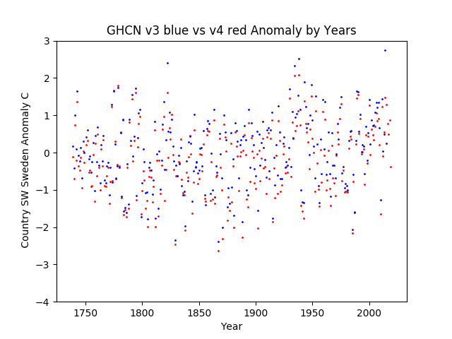
SW Sweden
Overall cooling of the past. Then there are what look like volatility reduction changes. Two spots with about 2.5 C of range between them, wiped out. Odd, given that such volatility is attested in the historical record…

Ah, looking at the anomaly chart makes it all clear. Can’t have those hot year blue spots or folks might start talking about how Sweden has had hot weather in the past. A line across the top of the highs doesn’t show warming. One through the bottom 1/5 or 1/10 of the graph shows a cold Little Ice Age, and then a most curious loss of cold after about 1995 with a compression of volatility (range) and a very fat tail. What is like a duck tail but rising to a rounded lump instead of a point? Maybe it’s a Lemming Tail… 😉
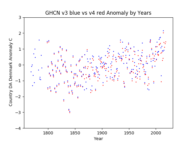
DA Denmark
Some patterns are so common they are boring. Again with the gentle cooling of the deep past and more vigorous cooling up through the baseline period. A full 1/2 C in many years. Guess that’s one way to find 1/2 C of “CO2 Warming”, just cool the baseline period by 1/2 C. Overall, about a 2 C range of non-adjustment adjustments in the data. Error bars anyone? Anyone?

The anomaly graph is interesting. You can sort of see the “pivot point’ around the 1960s where the dots are clear and sort of purple as some land on top of each other, then in the past they look like a ‘smear’ as they pull away from each other. Then recent data is more sporadically changed, but generally the ‘smear’ is to red on top instead of the bottom as in the past. Odd that they just dump the oldest warm data.
NO Norway
This one is a bit facinating. It must be viewed in the context of the next two “v4 only” graphs. So two remote places owned by Norway are added (or perhaps moved from Norway proper to their own “country”?) and Norway gets a trim of the “Duck Tail” to where it is basically flat on the anomaly graph. Is that becuase those two were split out of the prior data set, or because with them added with their big spike at the recent times, Norway could be made less obvious? Does this show that anomalies do not hide instrument selection bias, or that the Data Diddlers were working over time? What a choice…
So there’s 1.5 C range of “changes” in the current data recent years, but with a very unusual “cool the present”. IF I had to guess, I’d guess that it is an artifact of splitting out those two other places into their own “countries”. This is a minor “Dig Here!” to track where the Svalbard and Jan Mayan thermometers were “accounted for” in v3.3, if at all.

In the anonaly plot we have a significant loss of cold spikes after about 1995 and HAD a very nice “Duck Tail” spike, until in v4 we don’t. There is still the general “cooling of the past” and the “baseline” by about 1/4 C.

JN Jan Mayen [Norway]
No data in v3.3, so all we get is the v4 anomaly graph.
MariaDB [temps]> SELECT COUNT(deg_C) FROM anom3 WHERE abrev=’JN’;
+————–+
| COUNT(deg_C) |
+————–+
| 0 |
+————–+
1 row in set (0.00 sec)
We see basically nothing happening to the highs until about 2000. There’s a very pronounced “dip” in the cold ’70s when the Climate Scare Du Jour was that a “New Ice Age” was coming. Then, after 2000, things jump up about 3 C. Is CO2 supposed to “do nothing” until the year 2000 then cause 3 C in a step function? Uh, no.

SV Svalbard [Norway]
No data in v3.3 so all we get is the v4 anomaly graph.
MariaDB [temps]> SELECT COUNT(deg_C) FROM anom3 WHERE abrev=’SV’;
+————–+
| COUNT(deg_C) |
+————–+
| 0 |
+————–+
1 row in set (0.34 sec)
Rather remarkably like Jan Mayen. Nothing until “The Jump” ™ a bit before 2000. Anyone want to bet some airport expansion and increased construction happened then along with a new digital thermometer?

IC Iceland
Iceland is rather interesting. There’s a full 1 C of range of “changes” in the most recent data that’s supposedly the best there is. Why? Perhaps to reduce the very strong cyclical nature of the anomaly graph?

The anomaly graph has the recent hot side of the cycle roughly the same as the hot 1920s to 30s. Very strong cold dip in the “Baseline Period”, and then it looks like, about 2000, a big “step function” up. There was one year with a “normal” degree of cold after that, and the “changes” in v4 rubbed it out.

In Conclusion
This whole series has been grueling to do.
But now I’m done. Just a summary “index it all” posting to wrap around them all.
Just be glad all you have to do is look at a few graphs and read a comment or two about them 😉
My overall impression of the graphs and the data is that there is a “Tailoring” operation going on. The changes are NOT just a little fix up here and a correction there. It looks to me like it has direction and purpose. Cool the Baseline Period. Cool warm past periods. Warm the recent data UNLESS it is too high in the last 2 decades, then you cool them so the nearest data can look warmer in comparison. Stamp out cold periods in the middle. Remove cool periods recently if not already suppressed. The question that remains for me is just: “Is that an accident from ignoring the effects of Instrument Change, or a deliberate planned act?”
With that, I’m done with the v3.3 vs v4 comparisons! Yay! Over to you folks for more analysis.


